WANPO
A brand that would change the way we see our loyal four-legged companions.
Wanpo emerged as a response to the mass production culture in the pet accessory industry, redefining how we see and care for our dogs.
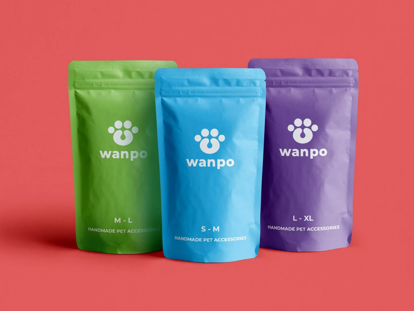
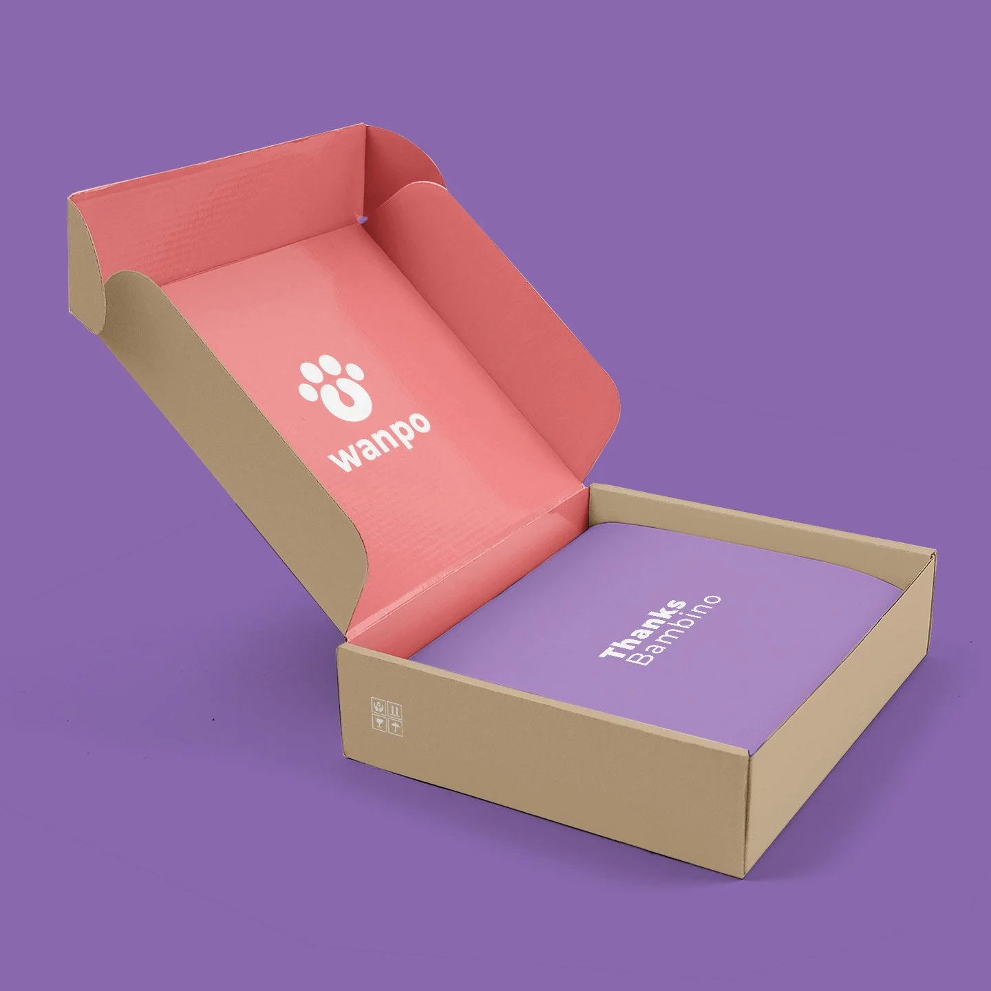
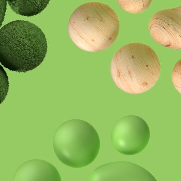
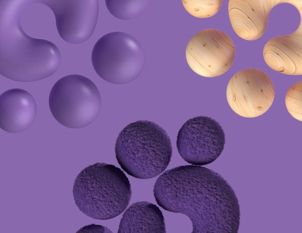
Rooted in local craftsmanship and community partnerships, the brand reflects a deep understanding of the human-canine bond, inspired by the concept of Neoteny. Its visual identity embraces texture, symmetry, and a vibrant color system, communicating joy, affection, and commitment.
More than a product brand, Wanpo became a symbol of compassion, sustainability, and the cultural shift toward seeing pets as full members of the family.
Branding
•
Creative Art & Direction
•
Logo Animation
•
Packaging Design
•
Branding • Creative Art & Direction • Logo Animation • Packaging Design •
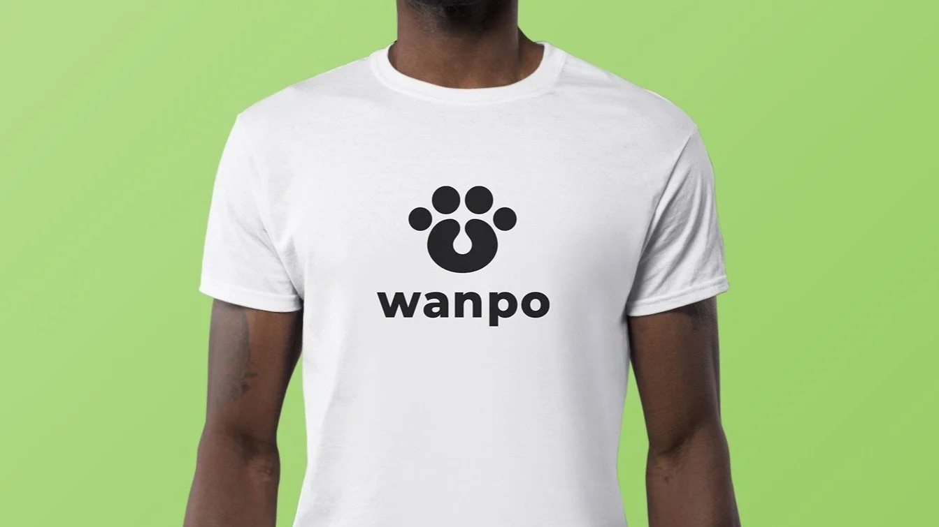
The logo design draws inspiration from Jeff Koons’ balloon sculptures. The identity system was built around symmetry, soft geometry, and tactile textures—mirroring both the structure of the accessories and the emotional texture of the human-dog relationship.
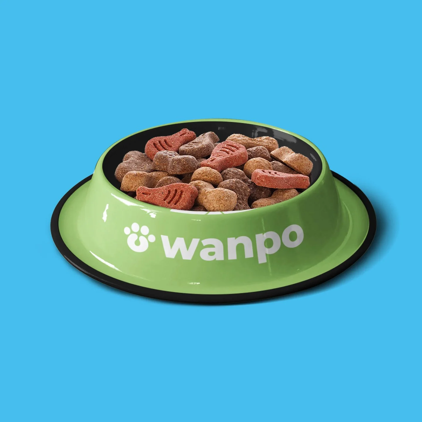
We introduced a vibrant, joyful color palette and fur-inspired surfaces to visually express the energy and warmth dogs bring to everyday life.
Wanpo’s branding merges social impact with product design—connecting local artisanship, sustainable materials, and the evolving cultural role of pets.