TIPI {CODE}
Tipi [Code] is a tech company focused on maximizing the potential of modern technology through services in IoT, system development, and data analysis. In an era where deep programming knowledge is no longer a barrier, they offer accessible, efficient, and scalable solutions for businesses of all sizes.
The brand identity is built around a smart concept: using punctuation symbols from programming to visually represent their three core services. The logo becomes a literal reflection of code—capturing both instruction and outcome, constantly evolving.
Tipi (Code) believes that effective branding bridges the gap between people and technology. Their mission is to enhance accessibility, understanding, and connection through innovative, tech-driven design.
Branding
•
Creative Art & Direction
•
Brand Animation
•
Branding • Creative Art & Direction • Brand Animation •
The brand uses the universal language of code—punctuation marks and simple shapes from the algorithm scheme—to visually structure the brand’s core services. When code is written, shapes take form and purpose. Each graphic element mirrors how code behaves and what it can create.
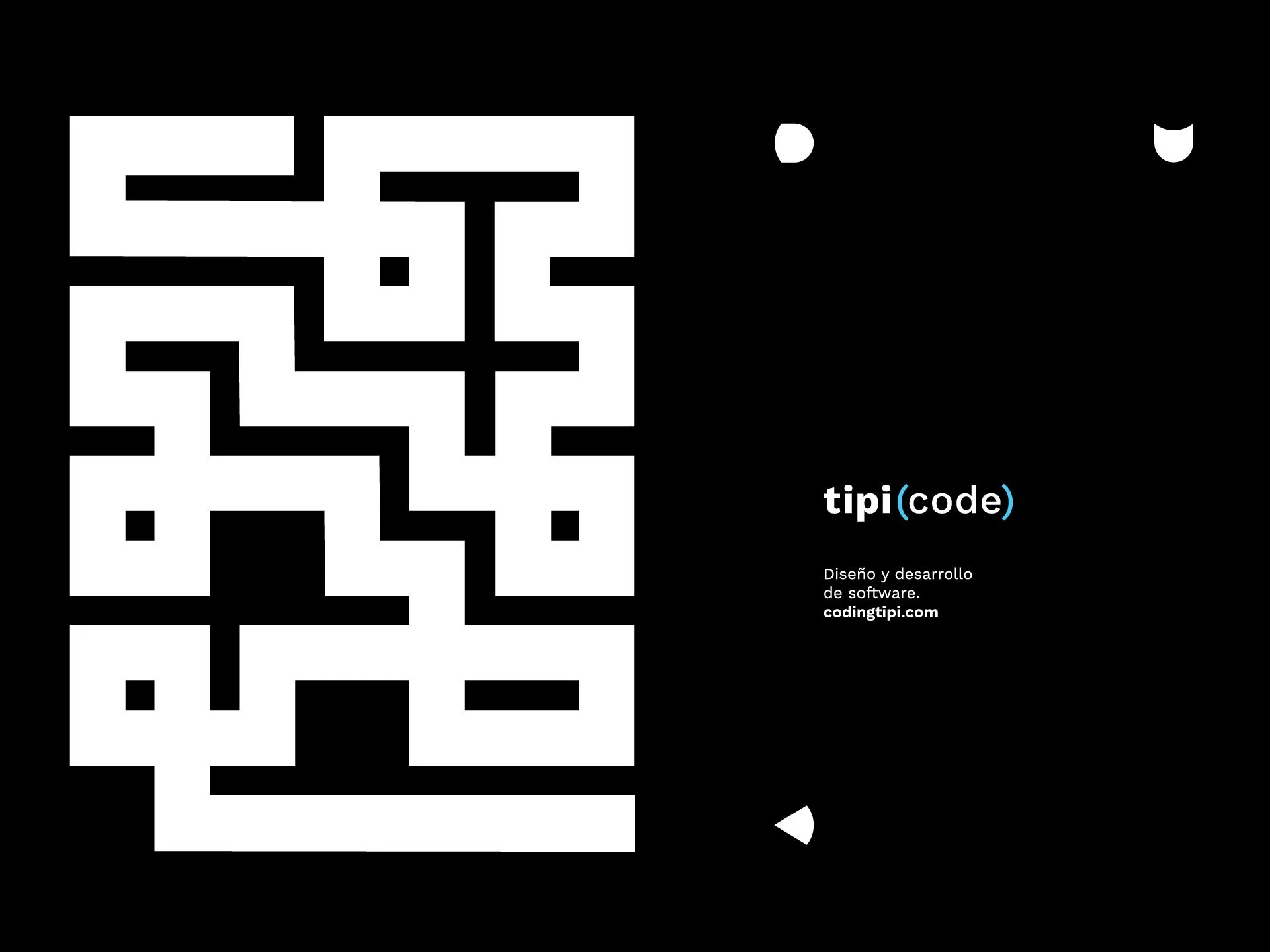
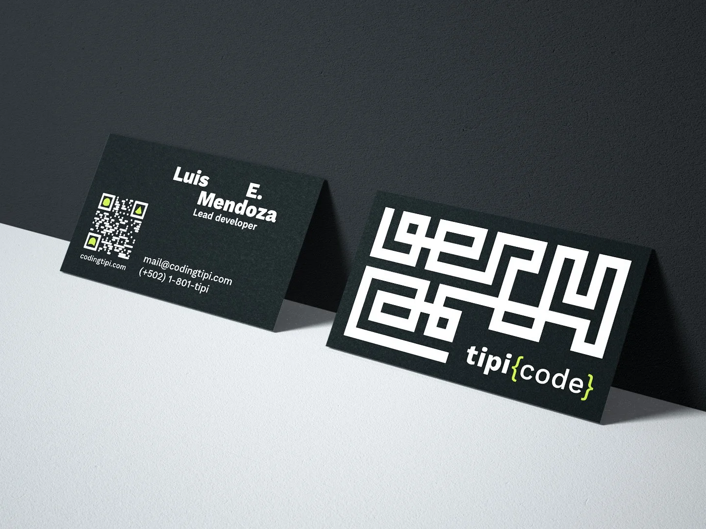
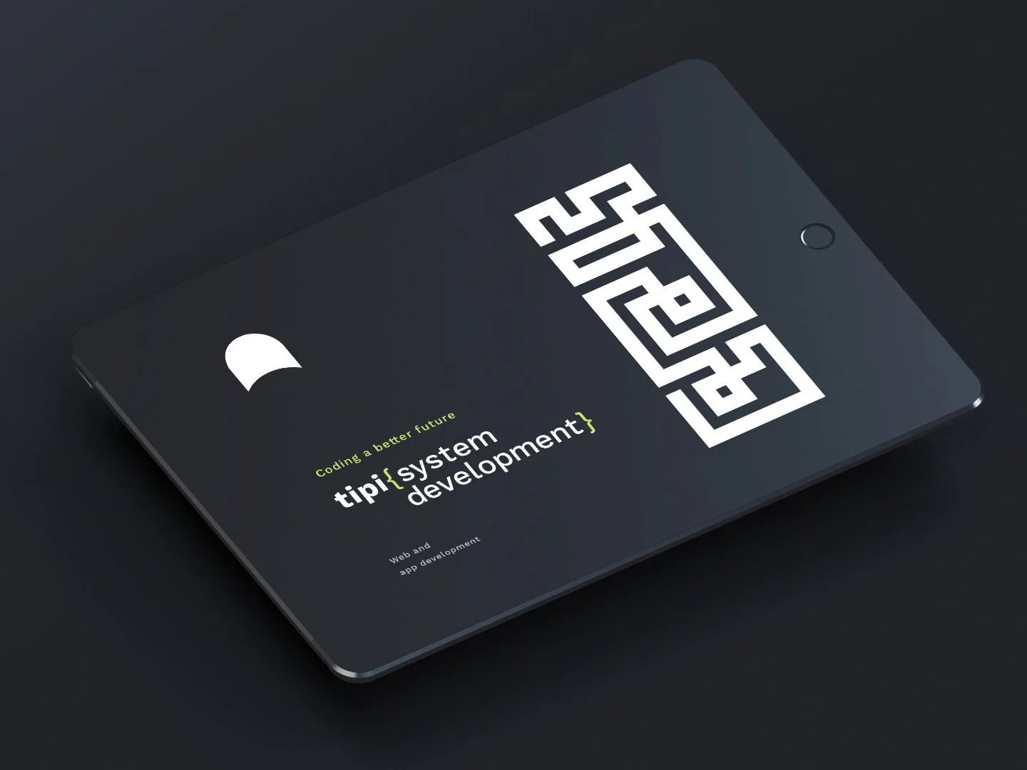
Each core service—IoT, system development, and data analysis—is represented by a distinct punctuation symbol in the logo: parentheses, brackets, and braces. These elements not only segment the offer, but also reference the visual syntax of programming itself.
By embedding programming logic into the visual language, Tipi [Code] becomes instantly recognizable to those who build with technology—and approachable to those who don’t.