NEXUS GROUP
Grupo Nexus redefined its position in the heavy construction machinery industry by going beyond machinery sales to offer a full-service model including consulting, logistics, and maintenance.
Its bold vision aims to lead the Central American market through innovation and strong human relationships. Visually, the brand is centered around a symbolic red thread—representing connection, continuity, and purpose.
This distinctive element sets Nexus apart in a saturated, conventional market, visually reinforcing its role as a bridge between ambitious projects and their realization. Through this identity, Grupo Nexus gives not just the tools for infrastructure, but lasting, meaningful relationships.
Branding
•
Creative Art & Direction
•
Presentation Design
•
Branding • Creative Art & Direction • Presentation Design •

The red thread is more than a design element—it’s a visual metaphor for connection, trust, and shared purpose.
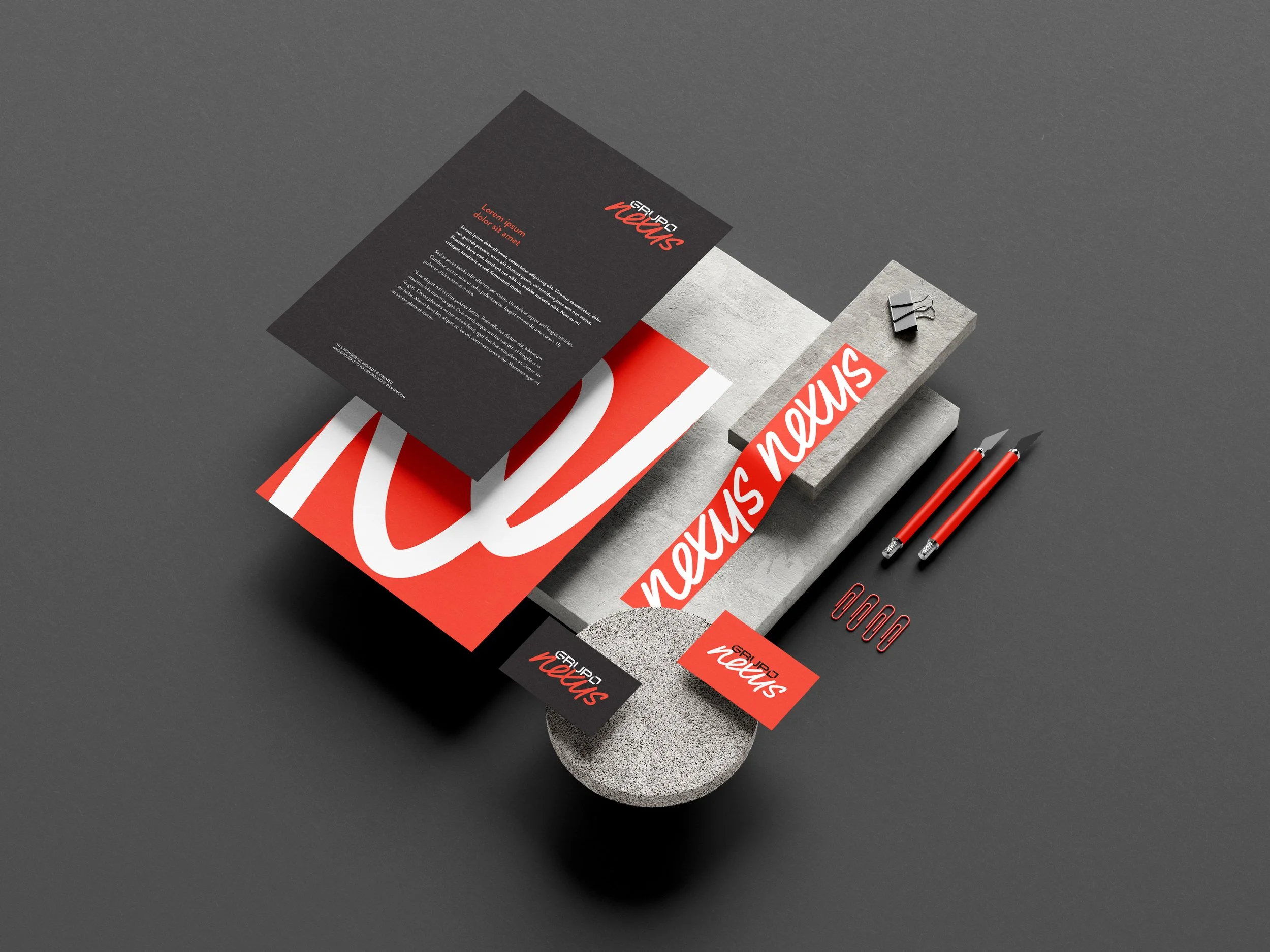
We broke away from the category’s visual norms—replacing cold, mechanical aesthetics with a warm, dynamic system built on clarity, human connection, and a vibrant red palette that signals energy and emotional presence.
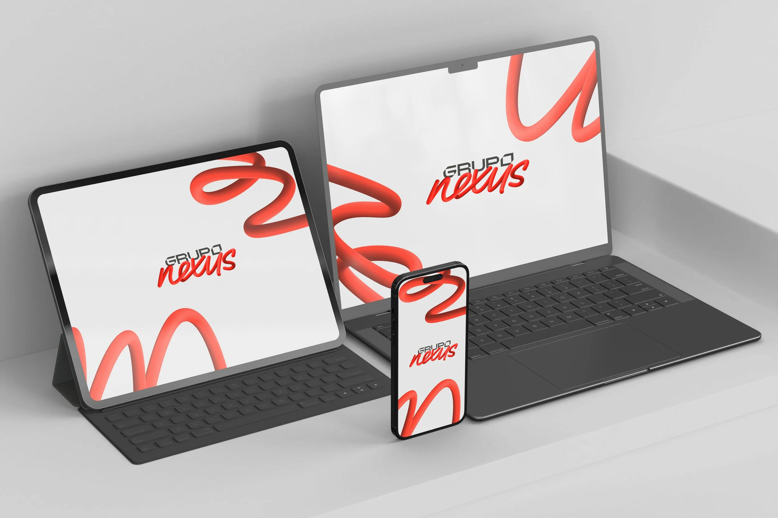

The identity was designed to reflect the full lifecycle of the service—not just the moment of sale, but the entire journey from consultation to long-term maintenance.
