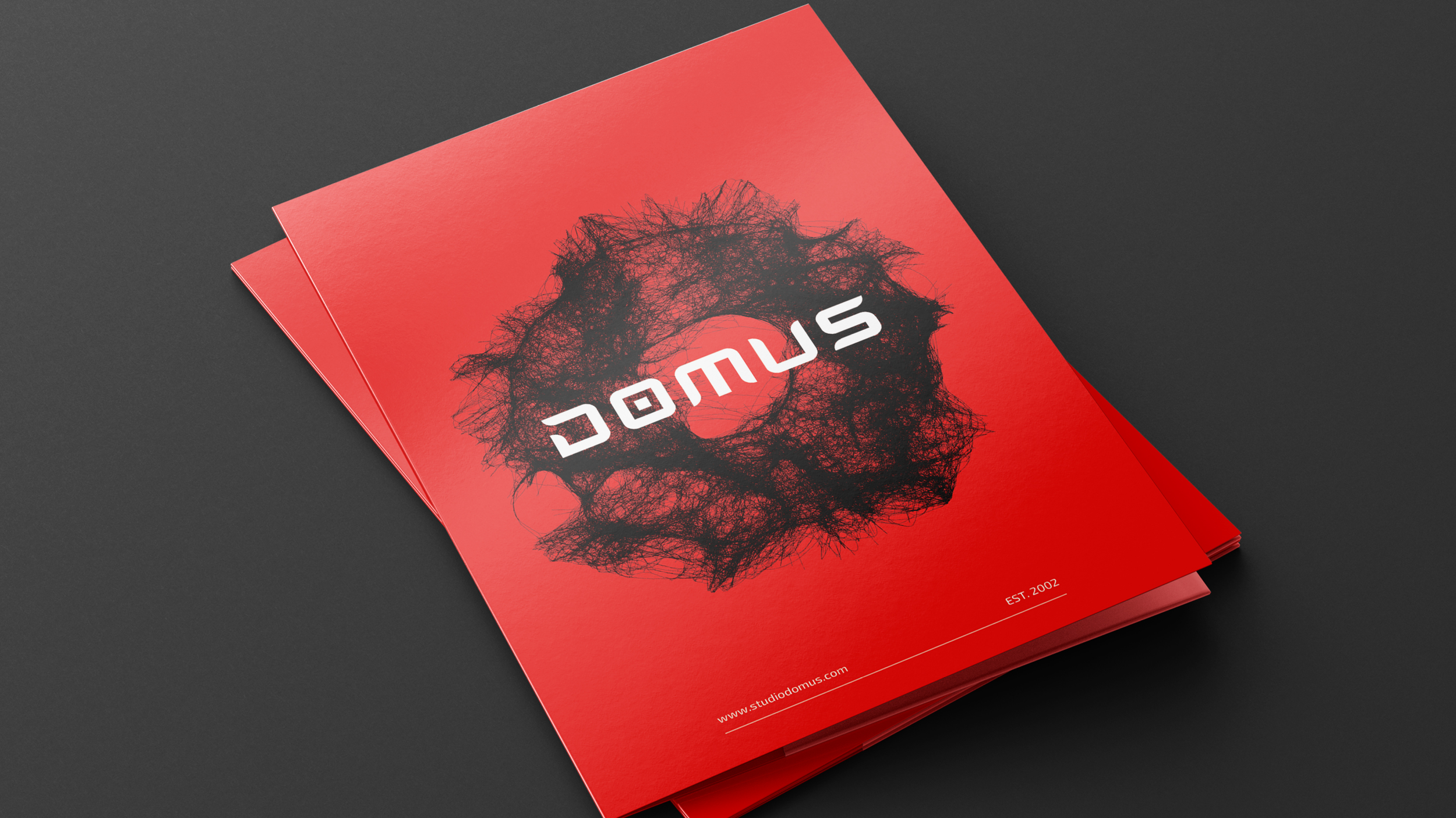
STUDIO DOMUS
Studio Domus has redefined architecture in Central America since 2002 with a bold vision rooted in technology, sustainability, and a radically disruptive mindset.
This rebranding channels the essence of the eagle—a predator known for its sharp vision, adaptability, and precise strategy. Every graphic element reflects these traits: typography captures the speed and precision of flight, while textures mirror the eagle’s visual acuity, capable of spotting opportunities from a distance.
Just as the eagle rules the skies with unwavering focus, Studio Domus leads the architectural landscape by anticipating the future. They don’t just design buildings—they transform culture, challenge conventions, and set the course for what’s next.
Branding
•
Creative Art & Direction
•
Social Media
•
Branding • Creative Art & Direction • Social Media •
Typography was selected for its aerodynamic qualities—narrow tracking, rounder terminals, and consistent contrast—mirroring the eagle’s focused movement through space.
“The visual identity is built around the eagle’s attributes: precision, adaptability, and long-range vision. These traits informed every design decision—from typography to spatial composition.”


“We developed a modular system that reflects Studio Domus’s ability to scale and adapt across formats, using directional lines, responsive grids, and dynamic texture mapping.”