The invisible past of typography in Guatemala

“Latin America has been influenced by trends in foreign countries since the time of conquest and colonization.”
The development that has led us to the culture we are today has been modified over the years by many historical, political and cultural contexts. Latin American culture is a mixture that has been developed from the identity of others. Cecilia Consolo comments that the approaches with other cultures, their heritage, their trade and political and religious impositions, introduced new signs and codes to the communication of Latin American society.The term of typography by Robert Bringhurst, defined as the purpose of giving the language a visual form, makes us consider that the use of new codes has not only been seen in artistic expressions that reflect cultural elements with which we identify today, but also they were implemented in the way we communicate. That is, the cultural identity of a country is also in the form of communication, its language and its visual expression. That is why the rescue of these signs began, with the purpose of preserving the cultural heritage of a place through the digitization of alphabets.Although Guatemala has many questions about the beginnings of its printing history. Little information has been obtained from research that helps to know data about Guatemalan colonial typography. José Toribio Medina says that Guatemala has been the fourth city in Spanish America that has managed to found his printing press, after Mexico, Lima and Puebla de Los Angeles in 1660. Although there are printers registered since then as: José de Pineda Ibarra, Antonio de Pineda Ibarra, Printing of San Francisco and Antonio de Velasco. The objective of this article is to contribute to the debate and enrich the historical content about the first typographic creations of the country through the history and creations of Sebastián de Arévalo. Whose work is recognized by the smelting of special types for some phonemes of the Cakchiquel language and listed as interesting for the time he worked as a printer. This study seeks as main objective the digitalization of the matrices that Arévalo developed during its printing.Introduction to the life of Sebastián de Arévalo
It follows that Sebastián de Arévalo began at an early age when he opened his printing press in 1727. He married for the second time with Juana Batres Martínez, after being widowed with the death of his first wife. His first publication was the Oración Funebre (Funeral Prayer) by Varón de Berrieza, since then the typographical conditions of his works are considered as quite understood in his art. His printing press was responsible for editing the first Guatemalan newspaper called La Gaceta and his most notable work was Arte de la Lengua Cakchiquel (Art of the Cakchiquel Language) by Fray Ildefonso José Flores. His most extensive work, and according to some authors, marks the peak of his career, was the Manual de Sacramentos (Manual of Sacraments) by Alvarez de Vega. Thus he continued for thirty-four years until 1772 with some interruptions in his process.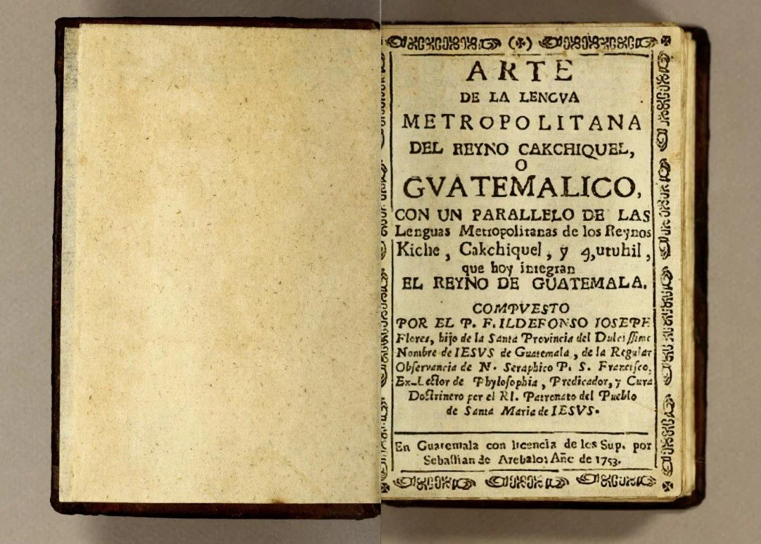
Arte de la lengua metropolitana del reyno Cakchiquel [Internet]. 1753 [cited 10 October 2019]. Disponible en: http://bit.ly/2M3119S.
For what Medina says, with the work of the Arte de la Lengua Cakchiquel in 1753, Arévalo had the need to merge special types to represent certain phonemes that existed in that language. The stimulus resulted in the casting of the letters of all his types three years later. On the other hand, for the Archbishop Francisco de Paula García Peláez, the smelting of his typefaces goes back to the year of 1742. For him, they were types that until now in no part of America had been manufactured, and even in Spain. However, Medina does not believed that the smelting of the types of Arévalo dates back to that year, since it is believed that Arévalo was careful to announce it to the public until 1756 in the Consulta Práctico Moral (Moral Practical Consultation) by Sunzin de Herrera, where the statement is clearly seen in its first page.To continue with the contribution to this debate between both authors, the historical and technical analysis of the typography used in these works printed by Sebastián de Arévalo during those years, could give basis to the origins, similarities and differences that these documents possess among themselves. To know the typographical category that existed in the years of this printer, documents that specifically talk about this in Guatemala are not obtained. However, some historical data on imports and exports of typefaces at that time, to cities like Puebla de Los Angeles and countries like Spain, help to understand the type influences that might existed in this country.Historical context to know the origins of Guatemalan typography
The printing press in Europe was already in great development by 1660, the same one in which it was founded in Guatemala. From that date, the church promoted several publications that seemed important for the evangelization of the aboriginal people. With the production of grammars of indigenous languages, Spanish evangelists were interested in creating graphic representations of phonemes that existed in these languages. Antonio de Velasco and Sebastián de Arévalo were the protagonists in creating special types for the printing of these sounds.Guatemala’s first printing press was founded because of the work of Sevillian Fray Payo de Ribera. Having to travel to Guatemala to appear in the bishopric, he had to postpone the printing of one of his works until he arrived in this country. However, it is said that he discovered that there was no printing press in this place, and that there were only in Mexico and Puebla de Los Angeles. For Ribera it was not worth it to raise its cost and difficulty in printing by taking it to such distant places, so it made the decision to find a printer with the necessary elements to move to Guatemala. José de Pineda Ibarra arrives then with his typographic material to Guatemala being this the first printer in the country. He was born in Mexico in 1629 and resided in Puebla de los Ángeles as a printing officer. He never owned a printing press until he arrived in Guatemala, since no work is known during his residence in that country. While dealing with the work of Payo de Ribera, he dedicated himself to less valuable impressions. It was until 1663 that he could deliver the work of Explicatio Apologetica.With this first work, Guatemala was in the middle of the typographical period classified by Maximilien Vox as Garald, the richest in the history of typographic production. With features that are influenced by Mannerist and Rococo movements. Guatemala did not see works that possessed Gothic writings as Mexico did. This is because for the seventeenth century the typographic styles of Mexico were changed to the Roman types of Garamond, Elzevir and Plantin. While in Spain the consolidation of the humanistic letter dates back to the beginning of the second half of the sixteenth century, and by the end of it was already in common use. These two countries are important in the study of the origins of the typography, since it follows that Guatemala is influenced by them.Import and export of fonts to New Spain
Given that the first impressions in Guatemala began with humanistic writings. We can also link this influence through the import and export of types from Spain and Mexico, half a century before Sebastián de Arévalo created his own.Although it is said that the creation of Arévalo dates back between 1742 to 1756, years in which Transitional typography is used most in Europe after the influence of rationalist philosophy and neoclassicism. The delay in importation and the influences that Guatemala possessed by these two countries must be taken into account. The typographic art in Spain, during the reign of Carlos II between 1665 to 1700, was in shortage and a notable lag, so the importation of matrices of producing centers from France and Flanders was promoted. In that period, it is logical to mention again that the contribution of these countries in typography was the richest and most significant of its century with the Garald category.On the other hand, the expansion had an impact on the colonies of New Spain. The impact of the Flemish typefaces is due to the commerce that the Iberian Peninsula at that time had with them. Where it is established that there were Flemish printers residing there, and even relatives of engravers who worked with the exponent of his time Christoph Plantin. These Flemish influences extended until the 18th century. So it is easy to postulate that this trade also influenced Guatemala in the matter on part of Mexico. It was not until the reign of Carlos III where Spanish typography finds its peak by Iberian punchers, a decade after the creation of Arévalo, thanks to the founding of the Spanish Royal Press. So it follows that during the first half of the eighteenth century there was no progress with typography in Guatemala.Matrix Study
Knowing about the typographical category in which the prints in this period were. And that although there are still doubts about the time of the creation of matrices by Sebastián de Arévalo. It is certain that these were not the first to be seen throughout America and even in Spain, as García Peláez comments. However, there is still the possibility that Arévalo created during this decade all of its species and it took time to finish all its matrices until 1756. Thanks to the documents digitized by the Guatemalan book collection by John Carter Brown Library, which has some works that were printed in the decades of 1736 to 1756 in the name of Sebastián de Arévalo and the Catalog of Tarjas del Museo de Libro Antiguo (“Tarjas” of the Museum of the Old Book) by Midilia Marroquín, during this period the development of its typography, its similarities and differences can be compared.“Within these documents, letters that are now considered key for the creation of typographic families were evaluated.”
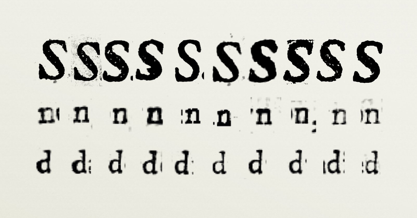
For example, letters that have a lot of DNA for these families such as R, S, a, g; as well as simple letters that give control such as H, O, n, d, p, o. From each of these ten books, the aforementioned letters were extracted to be able to overlap and compare each other as a whole.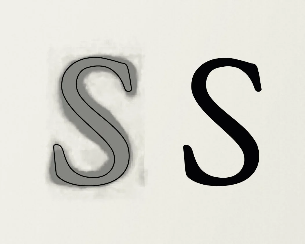
It could be seen that it is not possible to obtain many structural differences with each one. It is important to know that there is a maximum thickness or “gain” in some of these letters by the ink that the paper has absorbed as soon as it was printed, which means that the stroke of the letters is affected by this ink in different ways. Making some letters get a much more closed or narrow counterform, and in others, very thin strokes.“The comparison of these results gives a same structure or skeleton in common.”


Consulta Practico Moral [Internet]. 1756 [cited 10 octubre 2019] Available in: http://bit.ly/2VGhmEN
Even with the naked eye it is very easy to know that these letters have a similarity while progressing in each of them until reaching La Consulta Practico Moral. However, in this work, we can realize that the structure changes in a very minimal way, the counterform of the letters is larger than the others by very little, there is more balance. Although Arévalo’s work is quite recognized, it can be seen more thoroughly that some of its matrices do not have the best of their finishes, since there are some small differences in their anatomy. However, these differences do not greatly affect the anatomy of each of the letters and the same influence on which Arévalo is based. This can also be seen in absolutely all the letters of his works. It is important that, if I really wanted to find differences in this study, they should be evident when comparing them. It would greatly change the personality and spirit of the typography.Conclusion
It can be deduced that, although we do not know the exact date of when Sebastián de Arévalo created his first matrices, if the publication to the renewal of his printing and creation of letters were from 1756, there was no major difference in the anatomy of these along with the previous years he worked. However, it cannot be assumed that its matrices were created in 1742, since in works of previous years it also possessed these same characteristics and structures. With this a new doubt enters the debate. There is a possibility that the matrices that Arévalo created in 1756 were based largely on those he had previously, since these are those that have an even larger counterform than the others. This also leads us to think that the renewal of his printing press in that year focused only on recasting the matrices he already owned. However, a typographical work like Sebastián de Arévalo’s has not yet been seen in other works that were not his, making him an exponent of Guatemalan typography.

With this study it is possible not only to arrive at new hypotheses of the history of the printing press in Guatemala, but also it helps to establish the bases by which the technical process of typographic creation must be guided to fulfill its objectives and honor the past. Thanks to this information, the contribution to the debate and exchange that enriches the content of our history as Guatemalan graphic designers is also expected. It is important that the study of our cultural and visual heritage be of interest to those who engage in visual arts as part of the evolution and inheritance of an identity that connects us more to our culture and the way we communicate.Bibliography
Consolo C, lo Celso A, Garone Gravier M, Fontana R. Tipograía en latinoamerica. Orígenes e identidad. Primera ed. Blücher E, editor. Sao paulo: Blucher; 2013.
Bringhurst R. The Elements of Typography Style. Version 3.0. Tercera ed. Canada: Hartley & Marks Publishers; 2004.
Medina JT. La imprenta en Guatemala (1660–1821). [Online].; 1910 [cited 2019 julio 11. Available from: https://archive.org/details/b24853331/page/n9.
García Peláez AFdP. Memorias para la historia del antiguo reyno de Guatemala. [Online].; 1852 [cited 2019 julio 11. Available from: https://books.google.com.gt/books?id=ghsTAAAAYAAJ&pg=PA260&lpg=PA260&dq=Garc%C3%ADa+Pelaez+Guatemala+Memorias+Sebasti%C3%A1n+de+Arevalo&source=bl&ots=CSh8Z6Kk1k&sig=ACfU3U3igZ3MT1zZuXoLP1zTtY_Qa6u1uQ&hl=es-419&sa=X&ved=2ahUKEwj7pKX-2dbiAhVQnlkKHfKxC7gQ6AE.
de Herrera S. Consulta practico-moral. [Online].; 1756 [cited 2019 julio 11. Available from: https://archive.org/details/consultapractico00sunz/page/n1.
Cheng K. Designing Type: Laurence King Publishing; 2006.
Martínez Leal L. Treinta Siglos de Tipos de Letras. 1st ed. Distrito Federal de México: Tilde Editores S.A. de C.V.; 1990.
Galende Díaz JC. La escritura humanística en la Europa del Renacimiento. Espacio, Tiempo y Gorma, Serie III, Historia Medieval, t. 11, 1998, págs. 187–230. 1998 abril; III(32).
Garone Gravier M. El comercio tipográfico matritense en México durante el siglo XVIII. SciELO. 2012 octubre;(88).
Garone Gravier M. De Flandes a la Nueva España. Derroteros de la tipografía antuerpiana en las imprentas de España y México. Bibliographica americana revista interdisciplinaria de estudios coloniales. 2011 diciembre;(7).
John Carter Brown Library. John Carter Brown Library — Guatemala Collection. [Online]. [cited 2019 julio 11. Available from: https://archive.org/details/jcbguatemala.
Marroquín M. Catálogo de Tarjas del Museo del Libro Antiguo. primera ed. Ciudad de Guatemala: Museo del Libro Antiguo; 2003.
Puertas C. Reviving A Historic Typeface. Smashing Magazine. 2012 agosto.